

The Role of Color in Abstract Art
Color is one of the most deliberate choices an artist makes, and in abstract art, it carries even more weight. When there's no recognizable subject to anchor a piece, color becomes the main element communicating with the viewer.


Let’s look at how color and abstract art work together to change the way you see and choose wall art.
Why Color Carries So Much Meaning
Color psychology has been studied extensively, and the findings are consistent. We know that different hues affect our mood, energy, and focus in measurable ways. These responses are partly biological, partly cultural, and they happen whether we're paying attention or not.
In representational art, color serves the subject. A landscape may use greens and blues because that's what the scene calls for. In contrast, in abstract art, color isn't in service of anything except the feeling the artist wants to create. That's what gives it such direct impact and highlights the connection between color and abstract art.

How Abstract Artists Use Color
When you look at a piece of colorful abstract art, you're seeing deliberate decisions about emotional tone. The role of color becomes especially clear in the work of artists like Mark Rothko and Wassily Kandinsky.

Mark Rothko’s paintings of large rectangular fields of color with soft, blurred edges were built around the idea that color alone could produce a profound emotional response. He wanted viewers to feel absorbed by the work, not just observe it.
Wassily Kandinsky, one of the first abstract painters, developed detailed theories around color. He associated yellow with tension and energy, blue with depth and calm, and red with strength and stability. His work was essentially an experiment in using color as a direct language, bypassing the need for recognizable imagery altogether.
Most abstract artists working today operate from a similar understanding. Color choices are rarely arbitrary. They reflect what the artist is trying to communicate and how they want the piece to resonate with the person who lives with it. This is central to the role of color in abstract art today.

What Individual Colors Communicate
Each color used in abstract art serves a specific purpose in communicating with the viewer. Here is what each color tends to communicate:
● Red tends to signal energy, passion, and intensity. It draws attention quickly and holds it. Colorful abstract pieces with strong red tones work well in spaces where you want the art to make a strong statement.
● Blue is consistently associated with calm, trust, and clarity. It's one of the most versatile colors in abstract work because it functions well in almost any room without overwhelming the space.

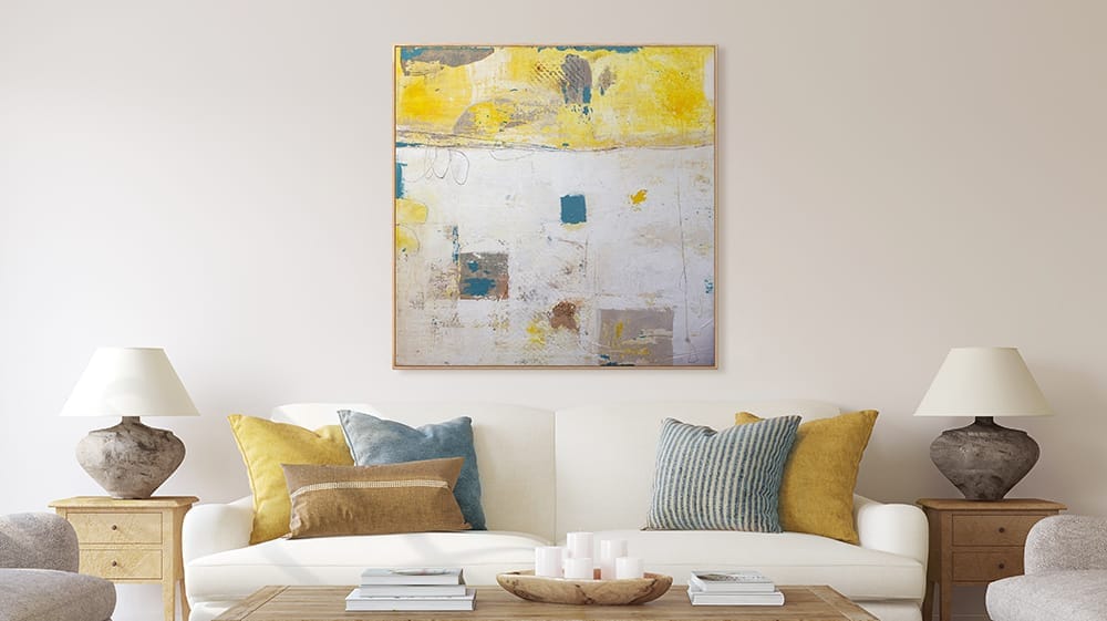
● Yellow reads as warm and optimistic. In rooms with limited natural light, a yellow-dominant abstract piece can shift the mood considerably.
● Green carries associations with balance and restoration. It tends to feel grounding rather than stimulating, which makes it a good fit for spaces where you want a sense of ease.

● Purple sits between warm and cool. It carries a richness that reads as luxurious or contemplative, depending on the shade and how it's used in the composition.
● Black-and-white abstracts work through contrast and form. They can feel refined or stark depending on the execution, and they tend to hold up well over time because they don't compete with other elements in a room.

These are general patterns, not fixed rules. Personal history and cultural background also shape how any individual responds to a specific color.
The Role of Color in Abstract Art and Your Space
Understanding the role of color in abstract art is directly useful when you're buying wall art. Color doesn't just sit on a wall. It changes the perceived temperature of a room, affects how large or intimate a space feels, and influences the overall atmosphere throughout the day.
This is something to pay close attention to when choosing abstract art for your space. A piece that looks one way in an office can behave differently in a home, as natural and artificial light shift across the canvas at different hours. A deep burgundy abstract might feel warm and settled in the evening and more energetic in afternoon light. A soft blue-gray piece might feel almost meditative in the morning.
The pieces that tend to stay meaningful to people over time are the ones where the color genuinely resonates, not just the ones that match a room's palette at the time of purchase. This long-term impact reflects the importance of color and abstract art in everyday living spaces.

How to Approach Choosing Abstract Art
Color is a big part of abstract art. The more you understand how it works, the more intentional your choices become, and the more the art you bring home will actually suit your space, especially when selecting colorful abstract art that fits your space and mood.
When browsing, pay attention to which pieces draw you in and think about what the color is doing. Is it energizing or calming? Does it feel warm or cool? Those responses are useful signals. They tell you something about how that piece will function in your space daily, not just how it looks in a photo. This awareness reinforces the role of color in abstract art in shaping your environment.
We believe art wields the power to inspire, energize, and transform people and places. Our team of curators and craftspeople are passionate about providing art that meets your unique vision and style.